TITLES FOR AN EDUCATION:
- Childish motifs like the hopscotch reflect the transition from childhood to adulthood
- Black and white colour scheme connotes drama, sophistication, and that there will be moral issues (good vs evil)
- Scientific motif connote the cold and calculated scheming of some of the characters
- Scholarly diagrams reflect her education. This includes the fact that she is still in school when the film starts, the education she gets from her courtship with an older intelligent man, and what she learns overall in the film
- The crispness of the lines as well as the monochromatic colour scheme shows the monotony and moral uprighness of her life in school, and explain her boredom with it.
- They help the audience understand her character in the beginning of he film, by reinforcing that she is still young and innocent
- Illustrates the juxtaposition between the different types of education she gets in the film
- Names are in capial letters to draw attention to them
- Crisp and clean white font can easily be seen and read, and connotes not just the school environment but her innocence as well
- Titles quickly fade on and off screen

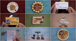
- Typically american food like nachos and corn dogs help establish the setting
- The bright primary colour scheme is continued through out the film and reflects its quirky nature.
- It introduces Napoleon's character as quirky and interesting, as well as informing us that he's in high school.
- Introduces food as a major theme
- Suggest youth and vitality
- Introduces high school setting
- All the titles are incorporated into the mise-en scene
- There is no one font, but many of the titles are handwritten in condiments onto various food dishes
- All the items specially created for the titles use different fonts, but at the same time fit with the quirkiness and the education theme running through out the titles
- The colour of the plate or food matches the surface on which it is placed on
- All the plates have have a definite colour scheme or style that all the food and the method of serving conform to
- All the titles are part of physical objects, so are placed on and taken off in shot
- Some of Napoleon's drawings are featured, which come up again later on in the film
- It is not made clear who's food it is, but Napoleon and his brother eat similarly wacky things through out the rest of the film
- The things in Napoleon's wallet set up his character, building enigma and anticipation
- We see some of his traits, with oblects like the UFO card representing him as a stereotypical geek
- Most of the titles don't include different people's roles in the production of the film, but focus on their actual names
- Some of the meals are rather packed lunch/school dinner like, building it up as a major part of the film
TITLES FOR JUNO:
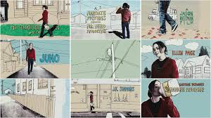
- Pale blue background reflects the season, and all the font colours are in autumnal colours
- As the camera follows her down the road, she walks behind a tree and as she emerges on the other side of it everything becomes hand drawn
- All the titles come on in different ways, some being unjumbled,
- Juno juxtaposes with the cardboard cut out surroundings, establishing her difference and suggesting that she will not conform to the norm during the film
- Montage editing
- Images that will emerge later on throughout the film like the chair are shoen in the background behind her
- Juno's name flashes differnt colours to emphasize it (it is after all the name of the film) and also to connote her individuality
- Some of the houses are drawn on graph paper, emphasizing her youth and that some of the story takes place at her high school
- Handwriting font reflects her quirkiness and the fact she's still in school
- The titles follow the lines created by the drawings in the background, such as along a fence, in a shop window or following a path/pavement
- Typical american surburban houses establish the setting and explain the reason for her boredom
- The titles colours change depending on the mise en scene in the background, with some matching Juno's jumper and Sunny D bottle/the runner;s outfits, and others matching the falling leaves
- Titles follow Juno around establishing her as the protagonist, and suggesting that she will also go on a journey throughout the film
- Her boyish costume is shown through a series of LSs, which also introduces her as tomboyish and definitely not a typical teenage girl heroine
- The simple colours and lines show the bleakness and boringness of the setting
- The setting looks like a story book, connoting childishness, whether Juno's baby or her own is uncertain
- Juno however, is not handdrawn, again re-enforcing the idea thst she is different and her own person, and that she doesn't have to follow society's rules
- The setting is continually redrawn and reshaped around Juno, but she carries on walking, connoting her strength, independence and nonconformity
- All the title shots feauture Juno in, making sure the audience know the that film is all about, and will be driven by, her.
No comments:
Post a Comment